I have always thought that the Facebook business pages needed quite a lot of improvement, given the kind of importance it plays for brands as well as Facebook’s own self (The source of its mammoth AD revenue driven by the acceptance of social media marketing strategy by every brand big or small across the globe). In a way, a business page in Facebook is supposed to be a brand’s at-the-moment snapshot with a narrative that reflects its persona. I believe that Facebook will eventually build much more depth for its business pages – a recent inclusion of online store option featuring prominently is just the starting point. And the social giant has been testing multiple versions of a new layout which will gradually roll out to all business pages. I think, the new Facebook page layout is far better in terms of user experience and branding.
The Brand Identity Got a Major Boost
Don’t know why Facebook realized so late that their previous masthead sucked, and it was a branding flaw that the businesses had to live with. The logo – a brand’s biggest identity was given a poor positioning with the top banner and a slew of ever-changing navigational tabs chewing of the prominence off the logo. With the new version, the brand logo has finally got its due respect; bigger in size, and the most prominent position
With this huge improvement on navigational structure – tabs being fixed-positioned on the left and available all along the scroll, Facebook indicates that it now wants to give much more vigour on the other sections as well. Expect much more features on the tabs like About, Reviews, etc in the near future. I wish Facebook gives more customization options for these sections.
Communicate More with Your Facebook Page Cover
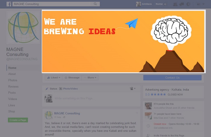
Now, with the logo and tabs off the most striking visual property on the page – the top cover, you have a lot more space to communicate with the Facebook cover image. Position your most important message on the centre of the cover image, as Facebook is yet to fix the mobile responsiveness issue for page cover. My wish list item on this is to have multiple images targeted for different mobile resolutions.
Hugely Improved Call-To-Action Adds More Value To The Business Pages
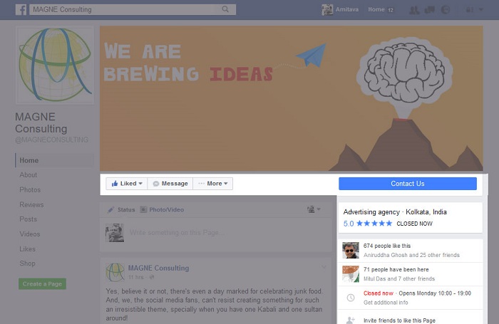
Notice that large blue call-to-action button ‘Contact Us’ just below the cover image on the right side? This is what sends traffic to your website or app from the page. Having a prominent focus on the button means adding more firepower to the footfall. However, the editing option for the Facebook admins is not too friendly.
One area that is poorly affected by this new change is the Facebook ‘Like’ button, which is now placed below the cover image on the left. Having a subdued action item in close proximity of a high contrast large property like cover photo will most likely make page visitors ignore it. This may well reflect that Facebook is not encouraging brands to invest on building followers through paid page likes growth option. Though Page Likes / followers count has become more of a social proof statement these days, there are still some juices left for the brand marketers to leverage it.
Having the Meta information like business category on the right side bar is intended to highlight it more than earlier. However, you should re-visit the categories you choose for your business. Facebook will only show the first category you choose from the list, so consider it carefully.
Page search placed below the category section should have been a bit more prominent. This is most likely to be missed by your page visitors.
As you may have noticed Facebook now gives Videos much more importance than photos, the Videos section comes before the Photos, followed by user reviews, visitor posts etc. Facebook is pretty aggressive on promoting native videos on its platform, and offers a plethora of added benefits for videos like the ability to generate custom audience out of viewers. This is truly a great way to identify people who engage with your brand better than the others.
About the Author


